Tea Packaging Design
Data Visualization | Packaging Design | Logo Design


Design Brief
Furthermore Tea (hypothetical client) is a small company in the wine country of Northern California. Their line of teas are crafted blends of locally grown herbs, and premium white tea leaves from the mountains of Fujian Province, in China.
The founders Mark and Christy started out in the wine business. After having great success in serving their renowned blends of quality teas with English-style biscuits after the wine tastings, they started a tea business and named it Furthermore Tea (in addition to the wine business). Their mission is to sustainably produce super premium teas. They are committed to use environment-friendly packaging with reduced materials that are also recyclable & biodegradable.
Design Concept
Based on the brief, it's likely that a large segment of their audience frequently go to wine tastings in the wine country. Therefore, I chose a style that is sophisticated, clean and modern to appeal to the taste of this crowd.
More importantly, the target audience are likely familiar with the words that are often used to describe wine tasting notes, such as floral, woody, earthy, etc. That's where I drew my inspiration from—a spider chart that describes the flavor of the tea blends (standard chart used in food science). Taking what is typically functional information and turning it into a visually rich infographic, making the packaging both visually appealing and unique, and allowing the products to stand out on supermarket shelves.
A project by Maggie Shi
Instagram: @viz.by.maggie
The Visualization (Front of Packaging)


The charts were given a flower shape (suitable for herbal blends). Then they were beautified in Illustrator through modifying the blending modes, transparency, and gradients. Chart elements were kept at a minimum. Potential customers can simply view them as artworks, or actually read the chart if they prefer.
The Legend (Side of Packaging)


For those customers who choose to read the charts, it is necessary to include a legend to explain how to read them. The legend is put on the left side of the box, in order to make it easy to compare to the front side.
Here, attibutes refer to the dimensions of tea flavor (what it tastes like), such as floral, woody, and earthy as labeled on the front of the packaging. When the tea is high in certain flavor, the corresponding petal is longer.
The Logo

The leaf symbolizes tea business, and the curled terminals of letter "r" ties to the origin of the company in wine country.
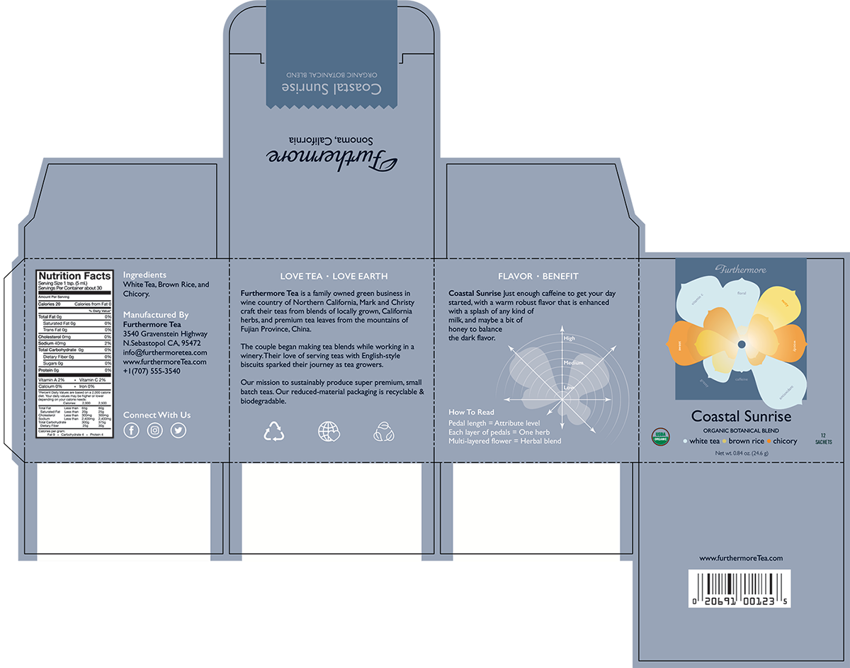
The Design with Die-lines and Bleed


The dark-colored rectangle that goes from the top to the front of the packaging resembles a seal, indicating where to open the box. It also serves as a background for the artwork for better visual depth.
The Process
After analyzing the brief and coming up with some concepts, a lot of research was conducted in food science publications. The goals are: to understand how sensory attributes are collected and analyzed, to decide which attributes are appropriate for the given herbal blends, and to gather quantitative data on the herbs.

Next, chart sketches were made to help with design decisions, such as: how many dimensions to show, the best arrangements for the axes and layers, the shape of flower petal, and what scale to use, etc. It's a balance between presenting data accurately and making it visually appealing.


The End Result

Thank you!
Instagram: @viz.by.maggie @designedbymaggie


